
Map Creation Process
To be able to create a map ready for printing, we worked for months. It took a lot of effort, time and resources to get where we are. For those of you who are interested in knowing more about the process of creating the map, this article is for you.
The process started in early 2016 with a group of friends who had a passion for mapping transportation in Cairo. The initial step was collecting all the needed data. The main purpose back then was to generate the data for creating a digital map for Cairo. To create a printable map, we had to handle the raw data with delicacy; we needed to maintain its richness while at the same time design a simple and readable map. We came up with multiple drafts to create the elements that constitute the current map. Finally, we left the office to test and get feedback from the ground. However, the process of development is a continuous one. Following is a brief description of each step along the way to creating this map.
Data Collection
Because the map is a representation of what exists on ground, we had to start from the field. The first phase of creating the map was fieldwork. Data collectors started working on ground to gather the transit mode routes, stops and times. Each data collector rode different transit modes and traced the path of the trips using a mobile app. The data was sent back to the office where it was processed by our Geographic Information Systems (GIS) team.
Handling the Data
Due to the massive amount of data collected from the field and the huge number of transit modes operating in Cairo, we needed to decide what information was essential for the commuter and what wasn’t. Given the nature of Cairo’s traffic, identifying the stops was the most challenging part. Based on several criteria, like the stops that are at the intersection of two main streets or of two routes, we chose which stops were important enough to get represented on the map. Another challenge was the representation of the routes. There are lots of vehicles that operate on the same path from the same transit mode. However, they have routes that are slightly different from each other. The high number of routes made visualizing all of them impossible on such a map. Our solution was to filter and combine several routes that operate on the same path so as to make the map more readable and commuter friendly.
This challenge was also solved by splitting the map into two separate ones, namely, ‘Getting around inside 6th of October’ and ‘Getting out of 6th of October’. The first map shows the internal transit modes, which in this case are the Box and Tomnayas, and the second shows the transit modes that operate from 6th of October to the rest of Cairo, which in this case are the microbuses and CTAs.
Visual Design
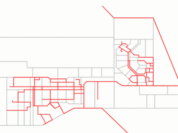
The first step to create the map was to create the base map with all streets and districts. Our aim was to simplify it as much as possible while retaining the most important roads and landmarks. We simplified the district and streets as well as all the routes that will be shown on the map. All lines drawn on the map are now either vertical, horizontal, or at 45-degree angles. This makes the map more appealing and comfortable to the eye. Finally, our artistic touch was all that was missing. Last but not least were basically design choices, which colors to use, line thickness, shapes, fonts and layout. This process took a lot of research and trial and error to achieve a fairly homogeneous construction and an easy-to-read and usable map.
Translation & Feedback
After finishing up the design of the map we worked on translating to both Arabic and English versions to maximize the target audience. And because everything new needs testing and feedback, we created two channels of feedback up until now. One was on social media, where we tested the map and its readability by the commuter. And one was on ground, where we did a survey in 6th of October City which included interviews with professionals, commuters, students and drivers. This helped us finalize and improve the map.