What’s the first thing you look at when you try a new public transport system? If you’re like most passengers, it’s the map.
Transit maps, signs, and station guides are meant to help us get from point A to B. But in many cities, especially across the Arabic-speaking world, these systems can be hard to follow – even for locals. The problem isn’t just language. It’s about how passengers navigate their cities and whether the tools we give them make sense.
At Transport for Cairo (TfC), we’ve worked on over 10 Passenger Information System(PIS) projects, most of them based in Cairo and the New Administrative Capital (NAC), with broader experience across varied urban settings. Our work spans several core themes: providing network-level information (routes, schedules, and fares), designing transit maps (cartographic[1] and schematic[2]), creating wayfinding systems, and developing user guides and travel materials.we’ve been rethinking how passenger information is designed – not for designers but for everyday riders. Along the way, we’ve learned three key items, mainly:
Map design should help passengers, not just impress designers
Design needs to accommodate both physical and digital infrastructure
Passengers know best
[1] Cartographic maps represent real-world geography with spatial accuracy. They maintain correct distances, angles, proportions, and positions of urban features. They are usually best used for providing guidance at a local scale.
[2] Schematic maps discard geographic fidelity in favor of conceptual clarity. They abstract routes into straight lines, regular angles, and equidistant stations.
Design that helps passengers, not just impresses designers
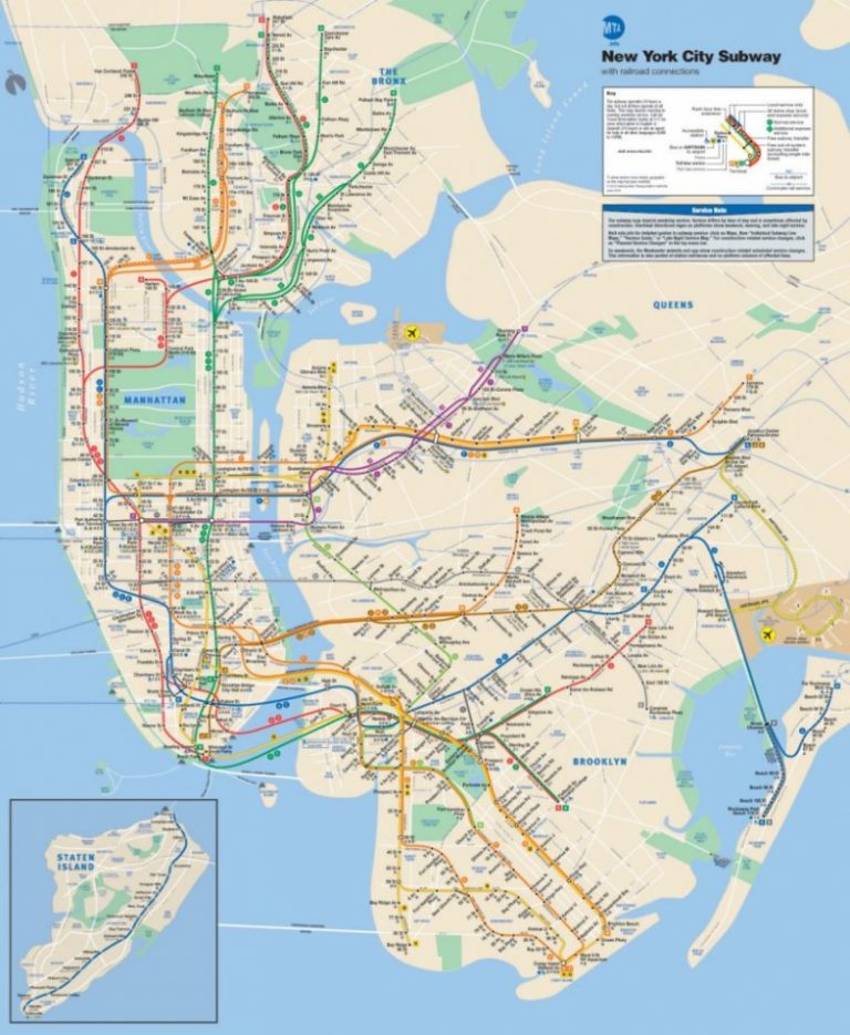
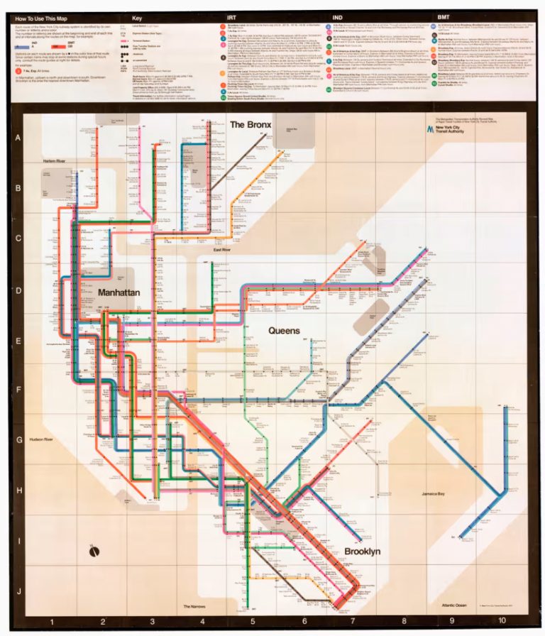
When New York tried a sleek, modern subway map in the 1970s, it impressed designers – but confused locals. Why? Because the map looked nothing like the city they knew: Central Park was depicted as a square, and the boroughs were rearranged. Passengers got lost trying to follow something that made sense on paper but not on the ground. (Stewart, 2023)
Figure-1 The 2013 geographic New York subway map by MTA
Figure-2 The 1972 New York city subway map designed by graphic artist Massimo Vignelli.
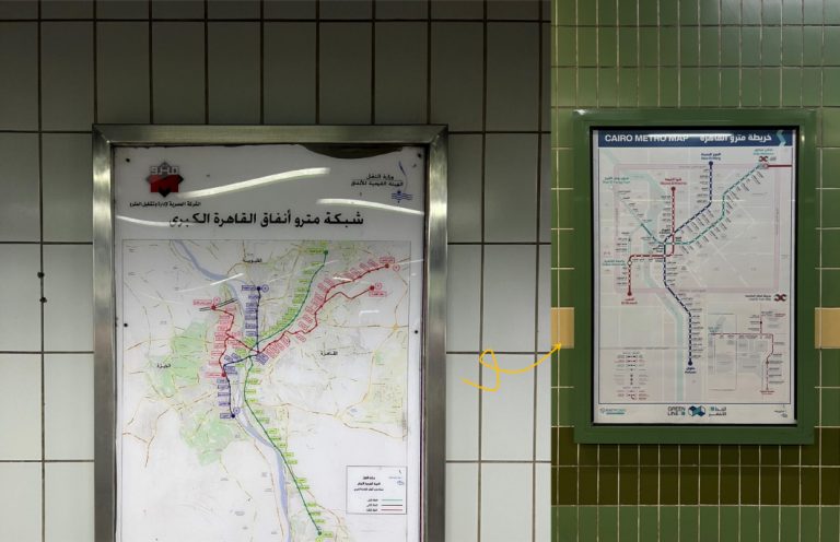
This challenge is not unique to New York. In many Arabic-speaking cities, riders often navigate using landmarks, major roads, or locally used names, such as unofficial neighbourhood names. However, typical transit maps, often adapted from Western models, leave out the spatial references that riders are most familiar with in many other cities.
So, we asked: What if maps didn’t just look clean – but actually helped passengers find their way?
In 2021, Transport for Cairo (TfC) explored that very question by redesigning the city’s first official underground network map. RATP-Dev Cairo (RDMC) had commissioned TfC to design passenger information maps under the rebranding and redeployment of Cairo Metro Line 3. Rather than following a purely schematic approach, the map integrated elements that aligned with how passengers already understood their surroundings. We were careful not to drift entirely from the original geographic layout to maintain existing user familiarity and avoid introducing an alien, hyper-stylized format. The result was a bilingual map, illustrated with Cairo’s most recognizable landmarks, framed by the Ring Road depicted by a distinct pink ribbon, a key urban artery, and oriented around the Nile, naturally dividing the city into East and West Cairo.
Figure-3 Original design of the transit network map (Left) TfC's 2021 network map for Metro Line 3 (Right)
Design needs to accommodate both physical and digital infrastructure
Riyadh is rolling out a large public bus network. But for many people, using it for the first time is daunting. That’s where maps and signs matter.
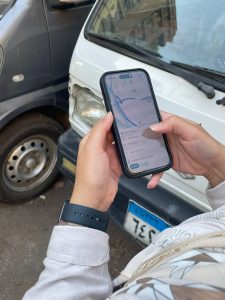
Yet increasingly, passengers skip printed maps altogether and go straight to Google Maps. Why? Because it tells you exactly what to do – when to leave, where to walk, what line to take – instead of making you decode a schematic or spatial layout. In a way, Google Maps removes the burden of reading a map altogether. It gives directions, not just an overview.
But even that only works if the right data is behind it. That’s why we have fed our GTFS (General Transit Feed Specification) data into a popular trip planning app – Google Maps – specifically in Cairo. By doing so, we’ve helped make real-time transit navigation possible in places where it was previously unavailable – or where printed maps were too abstract to help.
Figure-4 TfC maintains a GTFS feed for all modes in the Greater Cairo Region
That said, physical signage still matters. The digital divide and connectivity gap persist in many countries: Passengers don’t always have stable internet or smartphones at hand. At stations like Riyadh’s Takhasussi, TfC supported RATP Dev in redesigning the Passenger Information System (PIS) by introducing clear wayfinding elements, including neighbourhood maps[1], to help passengers navigate their immediate surroundings as part of their ridership strategy. Key elements included:
Adding familiar landmarks including malls, hospitals, major streets.
Using local familiar naming to ensure the maps reflect how passengers actually refer to places in everyday conversation.
Expanding station area maps so passengers see what’s nearby, even if the area is car-centric or still under construction.
Showing onward transit options including unofficial transport links passengers already rely on.
Adding travel time estimatesfor key off-map destinations.
In developing the Passenger Information Systems for the recently launched Light Rail Transit (LRT) service in Cairo, on behalf of RATP Dev Cairo, we designed both wayfinding as well as the maps systems. up to cover a 1-km radius, twice the usual size, because many stations are far from dense neighborhoods. That gave riders context: Where am I? What’s nearby? How do I get there?
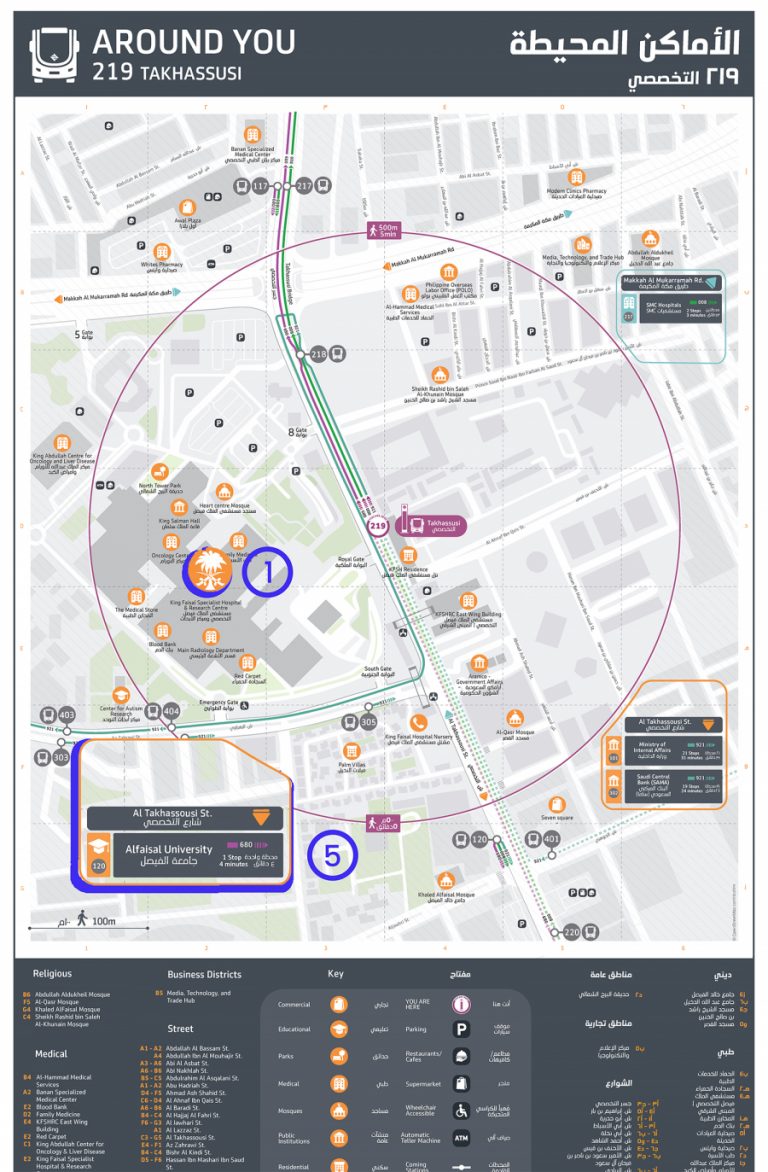
Figure-5 Neighbourhood Map for Takhassusi 219 Bus Station showing [1] & [5]
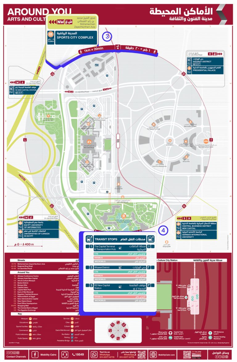
Figure-6 Neighbourhood Map for Arts and Culture LRT Station showing [3] & [4]
These additions aren’t just cosmetic tweaks. They help passengers make better and faster decisions and they make the whole network feel more reliable and intuitive.
[1] Neighbourhood maps display the local area around a stop/station, including nearby streets, places of interest (POIs), and walking paths.
Passengers know best
What’s the best way to ensure passengers can read the maps and other passenger information we’ve designed? We ask them!
Designing public transport maps is not just about how they look, but how well they serve the passengers using them. That’s why we try to incorporate participation into every stage of our design process. Our first-ever transit map for 6th of October City is an early result of our effort to make public transport in Greater Cairo easier to navigate. It is based on data from 2017 covering 366 processed trips and includes all transport modes active at the time – from long-distance trips served by formal buses operated by the Cairo Transport Authority (CTA) to short-distance trips provided by informal microbuses and vans.
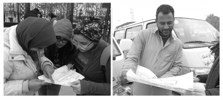
Once the design was complete, we tested it. We collected feedback through two channels: online via social media, and on the ground through a field survey in 6th of October. We spoke with students, professionals, drivers, and everyday passengers. Their input helped us improve wording, visual clarity, and the way different modes and landmarks were represented.
This participatory approach helps us catch issues early and adapt our designs to actual user behavior. Since then, we’ve applied the same process across new maps and plan to continue doing so in future projects.
Figure-7 The user-feedback cycle done on-site in one of the stations at 6th of October.
By making public transport easier to navigate, we are not just improving maps, we are enhancing accessibility, freedom of movement, and the overall user experience. Public transport systems in cities like Cairo, Riyadh, and beyond already work, but smoother, more intuitive navigation helps them work even better. When riders understand how to use the system confidently, trips feel easier, faster, and more predictable. This not only improves the experience of existing users but also invites new riders to give public transport a try.
As cities scale up investments in infrastructure, they must remember: design is not a luxury. It is necessary infrastructure. And it works best when it is made for passengers.
Are you looking to boost ridership and enhance the user experience through Passenger Information Systems (PIS)? Reach out to us at info@transportforcairo.com. We would love to collaborate.
Our team designs tools that help people understand and use public transport with confidence. From transit maps and wayfinding signage to station guides and travel information, our work makes networks more accessible and easier to use.